Download HKSI Logos and Usage Guide
If a picture does paint a thousand words, what is the logo of the Hong Kong Studies Initiative saying? Designers Malvin Chuang and Allan Chan gave us an insider’s scoop of its conceptualisation.
Interviewed and written by Gillian Chu
Gillian: What ideas came into play when you designed this logo?
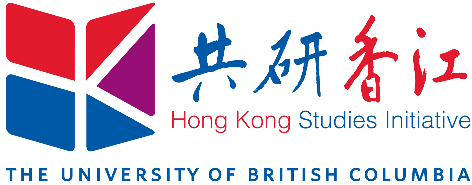
Malvin: The project started because of our common interest in Hong Kong, with the idea that there are always different perspectives when looking at the same event. Hong Kong is geographically small but plays an important role in the world because of its involvement in world politics and history. We wanted to design a logo that is simple but thoughtful, giving Hong Kong a way to reflect on its past while moving forward in future.
Allan: To me, Hong Kong studies is about Hong Kong’s history, culture, and language, and not just its current affairs. We wanted to create a brand that reflects Hong Kong’s heritage and values, as well as its contemporary situation. The idea behind the logo is that in this initiative many people from a variety of perspectives will gather to discuss what is happening in Hong Kong, expressing their unique points of view.
Gillian: Can you explain the design to me?
Allan: There are different ways and angles to look at an incident, and this concept is expressed through the positive and negative spaces in the logo. The logo takes on the shape of panels, illustrating different parties contributing their views in discussion panels.
Malvin: Designing a logo is an interesting process: as designers we are tasked to interpret what the client needs, help them visualise it, and give meaning to the creation. The logo reflects how the Hong Kong Studies Initiative is more than just listing out Hong Kong’s problems and solutions, but rather, hoping to explore the deeper meaning behind the events happening in Hong Kong. The logo symbolises those involved in the Hong Kong Studies Initiative would be exposed to perspectives from different sides, forming their own opinion as an informed individuals.
Gillian: What about the colours used? How did you go with these colours?
Allan: The blue is used as a colour to express the initiative’s relationship with the university, as well as Hong Kong’s relationship with the United Kingdom. The red is introduced to suggest Hong Kong’s ties with China. The purple is employed to symbolise Hong Kong’s state flower, the bauhinia. Through the symbolism of colours, Hong Kong is squished in between China and the United Kingdom.
Gillian: Why did you use this particular Chinese calligraphy and English font?
Malvin: The Chinese name of the Hong Kong Studies Initiative is laid out in the form of Chinese calligraphy, which gives the logo a Chinese flair, expressing the Initiative’s Chinese heritage. (Editor’s note: the calligraphy was provided by Mr. Yim Tse, a renowned calligrapher based in Vancouver.)
Allan: And because the Chinese calligraphy pops out, we wanted an English font that is clear and simple to communicate what the logo represents across to its audience.
Next time when you see the Hong Kong Studies Initiative logo, I am sure you will have a new level of appreciation for it!